zRoles
NRCS’s role granting product that provides employees access to various applications as well as certifying and reporting capabilities.
Problem
ZRoles was outdated, slow, and inaccessible. It lacked user documentation, didn’t meet accessibility standards, and often went down, causing agency-wide disruptions.
Outdated UI slowed productivity.
Accessibility standards weren’t met.
Frequent outages disrupted access to 35 applications for 7,000+ employees and affiliates.
About 250 administrators relied on it daily, but inefficiencies forced them to spend far too much time on routine tasks.
My Role
I owned the entire UX/UI design process, from research and workflow mapping to product strategy and design execution. Functionality changes were limited due to time and data constraints, so my focus was on modernizing the experience and making it usable and accessible.
Challenges
Timeline: The migration from DISC to AWS was rapid, compressing the design process and requiring immediate feedback loops while still ensuring accessibility compliance.
Technical: Backend data integrations couldn’t change. That meant I had to modernize workflows and UI without touching the underlying system—requiring close collaboration with architects, developers, and product managers.
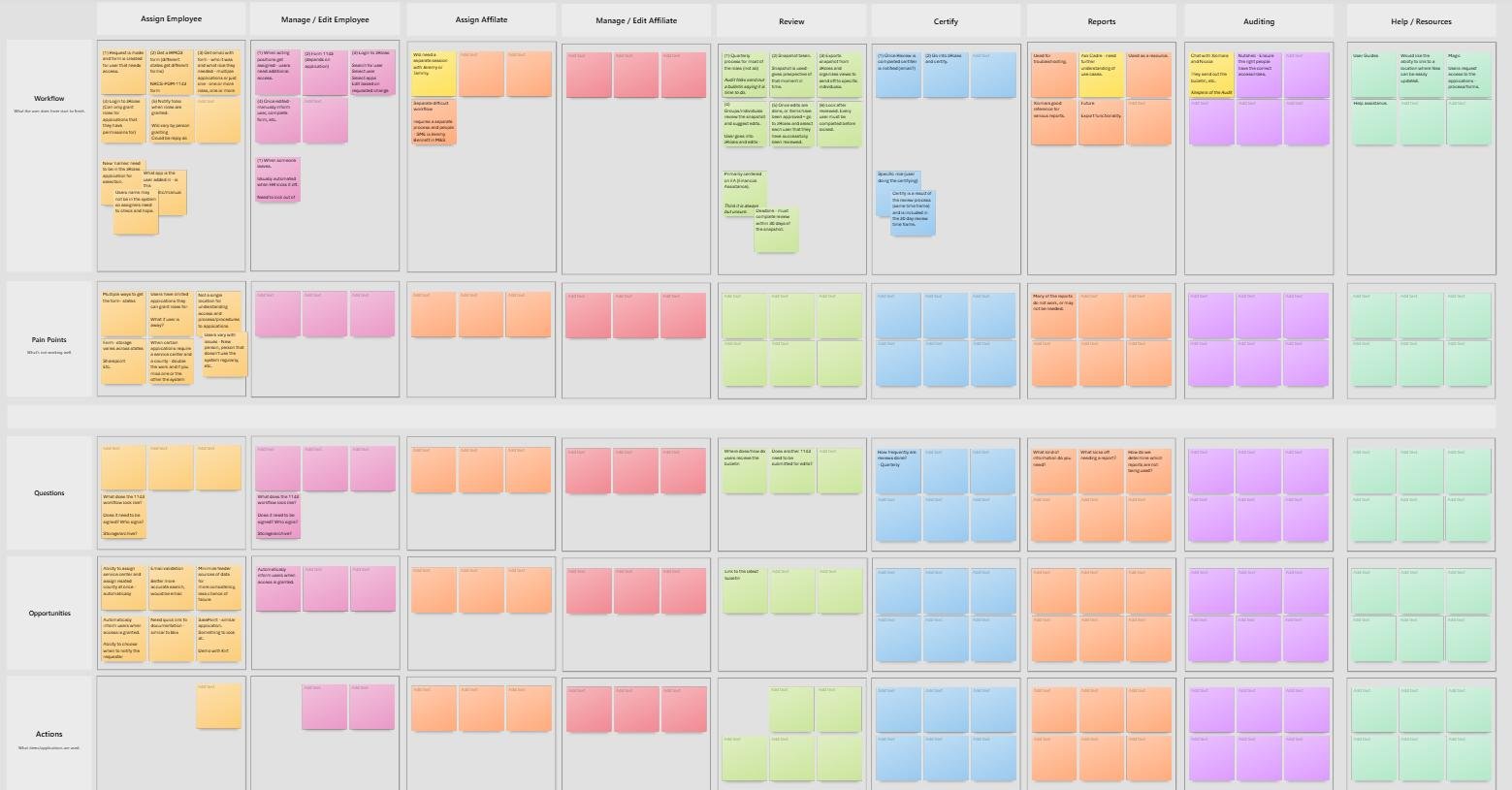
Discovery & Research
With tight deadlines, I had to be strategic.
Kicked off with a workflow and journey mapping session with the key stakeholder to quickly understand the product and process.
Formed a technical working group (architects, developers, PMs) to identify limitations and opportunities.
Partnered with the stakeholder to create a small user group for targeted sessions—digging into pain points, validating findings, and prioritizing needs.
This approach gave me just enough real-world context to design solutions that were both practical and impactful.
Solution
Since a full overhaul wasn’t possible, I focused on streamlining workflows through UI improvements.
Replaced dense tables with a card-style UI for faster scanning and review.
Simplified workflows so users could focus on tasks instead of wading through data.
Introduced scope views, scope selection, zones/teams, and clearer verbiage.
Improved accessibility, reporting identification, and added a Help Center.
I worked hand-in-hand with the technical team to ensure feasibility, then validated designs with the user group. Their feedback was essential in refining and prioritizing changes.


Summary & Reflection
This project moved fast, but it reinforced a core belief: you can’t design in a bubble.
Every time I showed users a design, new insights surfaced, sometimes changing the direction entirely.
Collaboration with both users and the technical team was critical; I only shared designs that were realistic to build, because setting false expectations helps no one.
The result? A modernized, accessible product that users were genuinely excited about. They felt heard, included, and relieved to finally have a tool that worked with them instead of against them.
This project was as gratifying as it was challenging—proof that even under tight constraints, thoughtful design and real collaboration can deliver meaningful impact.