E-Commerce Website
Trade data website that helps customers identify the right solution for their needs, simplifies free trial sign-ups, and ensures smooth customer conversion to paid with full product functionality.
Problem
The core issue was that customers struggled to understand a complex trade data product, and the checkout process added unnecessary friction. The website needed to simplify the product offering, make trial sign‑ups easier, and guide users smoothly into paid conversions. At the same time, it had to capture valuable customer insights and support marketing efforts without overwhelming users.
Customers found the product difficult to interpret and navigate.
Checkout flow created confusion and slowed conversions.
Trial sign‑ups weren’t seamless enough to encourage adoption.
Marketing and sales teams lacked clear customer insights from the process.
The challenge was to reduce complexity while maintaining functionality and scalability.
My Role
I led all UX/UI design for the website. My responsibilities included redefining the checkout and sign‑up process, conducting user research, developing personas, shaping product strategy, running usability testing, and creating the marketing strategy to support the launch.
Challenges
Designing the website meant balancing ease of understanding, conversion, and marketing goals while keeping the experience approachable. The main challenge was simplifying a complex product and making sure the flow worked for both customers and the business.
Managing multiple product tiers, billing options, and add‑ons without overwhelming users.
Capturing leads early while keeping sign‑up smooth and non‑intrusive.
Keeping trial users engaged long enough to see product value.
Aligning design choices with marketing and sales strategies.
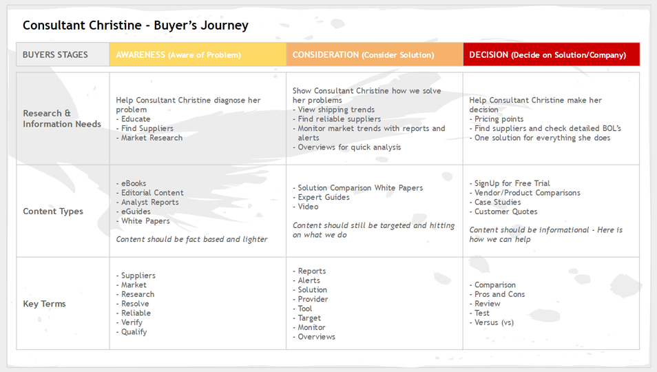
Discovery & Research
Once the requirements and goals were set, I moved into persona development. Through interviews and surveys, I identified three key personas and mapped out their buyer journeys. These personas became the foundation for focused web pages, site functionality, product development, and the email marketing strategy. The buyer journey framework also gave the sales team a clear way to identify where customers were in the process so they could better support their needs.


Solution
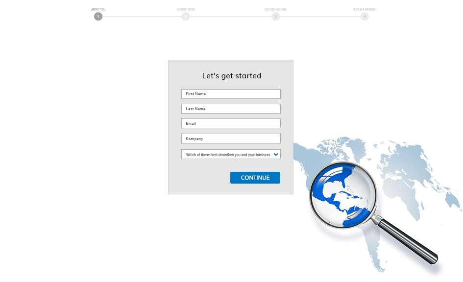
I established wireframes early and moved quickly into prototyping and testing. The goal was to spark interest in the 7‑day trial while keeping checkout simple and trustworthy.
Balanced product information with a streamlined trial sign‑up.
Simplified checkout despite multiple tiers and billing options.
Added a sign‑up step before checkout to capture leads early.
Designed tailored emails and discounts to re‑engage incomplete sign‑ups.
Iterated through multiple rounds of user testing to refine the flow.
Ensured the design supported both customer needs and business goals.


Summary & Reflection
The real impact came after launch, when continuous optimization drove measurable results. I was constantly analyzing the websites performance and refining the experience.
Analyzed site performance with CrazyEgg and Google Analytics.
Adjusted checkout and pricing pages based on customer feedback.
Tracked heatmaps and page views to understand user behavior.
Daily trial sign‑ups doubled after improvements.
Captured valuable customer contact information to expand marketing reach.
Combined design expertise with marketing strategy to deliver a well‑rounded experience.
Built a framework the team could continue to evolve after launch.
This project gave me a full view of the e‑commerce process and allowed me to apply both my design expertise and marketing skills to create a well‑rounded user experience from start to finish.