Trade Prospects
A product that lets users search for importers and exporters by company, commodity, trade volume, country, and even down to the zip code within a specific U.S. state.
Problem
Users needed a way to navigate complex trade data without feeling overwhelmed. The product had to present detailed shipment information, partner relationships, and company demographics in a format that was approachable and engaging. At the same time, it needed a consistent design system that could scale across future product lines to ensure usability and brand cohesion.
Complex import/export data was difficult for users to interpret.
Shipment details, partner relationships, and demographics needed clearer presentation.
The experience had to feel intuitive and engaging, not overwhelming.
A scalable design system was required to support future product lines.
Usability and brand consistency had to be maintained throughout.
My Role
I was responsible for all the UX/UI design elements for the product as well as any and all research that was needed. This included user research, persona development, unified data selectors, a visual map selector, interactive chart tools, usability testing, and shaping the overall product strategy.
Challenges
The design process was about keeping things clear and easy to use while still supporting the complexity of the data. At the same time, I had to make sure the design system wasn’t just intuitive but could also scale smoothly as the product grew.
Translating technical import/export data into a user‑friendly format.
Presenting shipment details, partner relationships, and demographics in a clear way.
Designing a consistent look and feel that could extend to future product lines.
Ensuring usability without oversimplifying the data.
Aligning design choices with both customer needs and business goals.
Discovery & Research
Through customer interviews, two main personas were identified. I held brainstorming sessions with the development team based on customer input and we began shaping the product’s structure. I created a basic wireframe and shared it at different stages with interviewees to gather feedback. That feedback became the backbone of the product direction and guided both design and development decisions.


Solution
The product relied heavily on step‑by‑step selection, so I designed a left‑side navigation to give users more space and keep everything contained in one view. This approach allowed users to immediately see changes based on their choices and made the experience feel seamless.
Designed left‑side navigation for clarity and space.
Allowed users to see immediate changes based on selections.
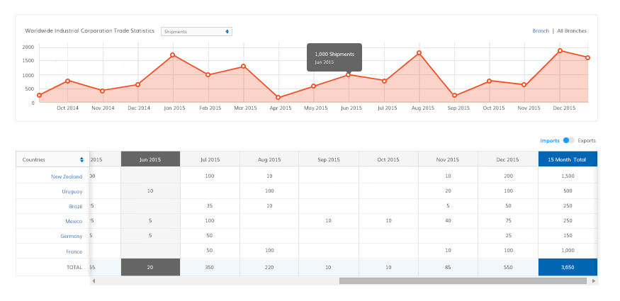
Transformed raw import/export data into an engaging experience.
Used drill‑down maps for quick overviews of stats.
Built interactive graphs for detailed insights in a clean environment.
Created a professional, approachable interface that balanced depth with usability.


Summary & Reflection
Onboarding was gradual, which gave me the chance to collect feedback quickly and refine the product in real time. Continuous improvements ensured the experience stayed aligned with user needs and business goals.
Rolled out onboarding gradually to gather feedback.
Used Google Analytics to track feature usage and identify improvements.
Applied enhancements continuously to refine the user experience.
Collaborated closely with the development team to solve challenges.
Brainstorming sessions led to creative, effective solutions.
Product became the foundation for future product lines.
Received strong reviews from both business stakeholders and end users.
Proved that complex trade data could be delivered in a way that was intuitive, engaging, and scalable.