Enterprise Solution
A trade data research tool built for large companies. It brings together shipment details, partner relationships, and company demographics into one platform. The product also combines data downloads with a dynamic dashboard, giving enterprise users powerful insights in a single, easy‑to‑use experience.
Problem
The product needed a refreshed design that modernized the interface and created a more intuitive experience for users. At the same time, the admin portal required a cleaner, more functional layout to better support customer needs and make the overall experience feel cohesive.
Existing interface felt outdated and unintuitive.
Admin portal lacked clarity and functionality.
Needed a design refresh without disrupting core product workflows.
Goal was to create a cohesive, modern experience across both product and portal.
My Role
I was the lead UI/UX designer, responsible for shaping the product’s overall experience and guiding the design vision within the constraints of existing functionality, with creative freedom to improve the admin portal.
Challenges
This project was a strict redesign of an existing product, which meant refreshing the look and feel without changing how it worked. The challenge was to modernize the interface while keeping the structure intact.
Limited scope restricted changes to functionality.
Needed to refresh design while preserving established workflows.
Ensured updates aligned with both customer expectations and technical constraints.
Balanced creativity with the boundaries of a redesign project.
Discovery & Research
Because the scope was limited, I didn’t need to run a full discovery process. Instead, I focused on gathering insights to develop personas and spent most of my time observing how customers actually used the product. This approach gave me a clear view of where the experience could be improved and helped me identify enhancements that fit within the boundaries of the existing functionality
Solution
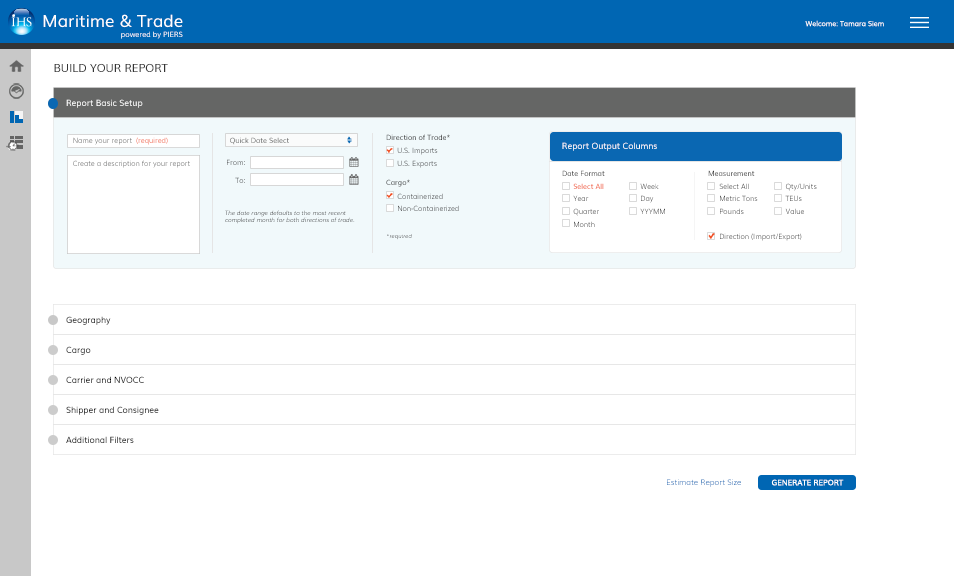
I kept the overall framework in place and focused on improving the interface. The redesign prioritized usability and clarity, especially in the admin portal.
Introduced a left navigation bar for easier access.
Redesigned the admin portal for a cleaner, more intuitive layout.
Modernized the interface to feel consistent and professional.
Delivered a refreshed design without altering functionality.
Summary & Reflection
The product launched successfully, and customers responded positively to the new design and enhancements. While the scope was challenging, the project reinforced the importance of focusing on impact within constraints.
Launch received positive customer feedback.
Improved usability and cohesion across product and portal.
Strengthened communication and collaboration across teams.
Learned to focus on areas of greatest impact despite limitations.
Reinforced the value of design discipline in constrained projects.


